
Wednesday, July 28, 2010
Tuesday, July 27, 2010

Gallery Reception
The New Hampshire Furniture Masters

On Thursday, July 15th, I attended a reception for the New Hampshire Furniture Masters at the Lamont Gallery. On exhibit were furniture pieces from a dozen artists from New England. The event was well attended and the artists on hand each had groups of furniture collectors and admirers jockeying for their attention. I have come to know a few of the artists from this group and have developed the beginnings of what i hope to be long working relationships. Below are some examples of work from the people i spoke to the most.

"Two Energies Foyer Tree" by Brian Sargent. I like the way Brian used mixed materials in this hall piece. I also make mixed material works and think of my materials in a similar way.

"Waitsfield Side Tables" by Sam Norris. Sam's tables are simple but supremely elegant and finely crafted.

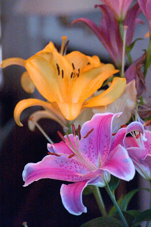
"Botswana Recollection" is by my next door neighbor Jeffrey Cooper.

The "New Wave Table" by Tom McLaughlin was not in this show but will be in the upcoming auction next month.

Likewise "Contemporary Bergere" by Aurelio Bolognesi was also absent but soon to be seen.
Monday, July 26, 2010


Friday, July 23, 2010
Class Portrait

The above image contains every student in the class. Each layer closer to the top has a lower opacity then the one below it ranging from 10% at the top to 100% for the photo on the bottom.

This is me if i were pretty.
Thursday, July 22, 2010

Tuesday, July 20, 2010


Monday, July 19, 2010


Sunday, July 18, 2010
Light and Dark in Northwood
While taking a break from hanging sheet-rock on my brothers ceiling i took some images of his backyard. I made multiple exposures in order to capture the details of the darkest and the lightest areas of the landscape.

A meter reading off the water leaves the shadows very dark. The colors are ok, i think, but i feel like i would be scared of bears down there.

A meter reading off the trees blows out the water and sky.

By combining several images into a balanced single HDR image the details and colors in the shadows and highlights are rendered more vibrantly then in any single image.

Dark.

Light.

Better.
Some Exercises From Chapter Ten
Contrasting, or complementary, colors make images more vibrant and exciting.

This image of the blue guy squirting himself has naturally kinda high contrast between colors and the lighting on his body. I think its fun to look at. Yeah!

A yellow orange oil containment float on a purpley blue green sea makes for a very graphic picture with the saturation dialed up a little.

The saturation dialed up just a little itty bit on this shot really pops the wooden piers against the blue of the sky and river and helps to push the perspective.

It cost me 75 cents to take this picture at an odd angle looking down into the street from the parking garage on high street. So love it.

And, yes, clouds would look funny yellow. I wanted a red seagull but i got this instead.
Thursday, July 15, 2010
Water in Motion: Fast and Slow
Fountain in Market Square, Portsmouth. Photos were shot with an ISO of 100 an aperture of 4.5 and a variety of shutter speeds to achieve different effects. I did boost the color saturation moderately to highlight the color reflected in the water.


Subscribe to:
Posts (Atom)